Swing Trade System# Swing Trade Strategy - Complete Guide
## Overview
This is a comprehensive swing trading indicator for TradingView that identifies high-probability trend continuation setups using multi-timeframe analysis, pullback patterns, and momentum confirmation. The strategy combines technical indicators with risk management tools to help traders capture swing moves with defined risk-reward parameters.
## What It Does
The indicator identifies two types of signals:
1. **Base Signals** (small markers) - Initial setup detection with basic criteria met
2. **High Confidence (HC) Signals** (large markers) - Fully confirmed setups with all filters passed, including optional higher timeframe confirmation
Once a HC signal triggers, the indicator automatically plots:
- Dynamic stop loss levels (trailing, break-even, or static)
- Partial take profit (TP1) at 1R
- Final take profit (TP2) at your chosen risk-reward multiple
- Real-time R-multiple tracking
- Confluence dashboard showing all conditions
## How It Works
### Core Signal Logic
The strategy identifies pullback-to-trend entries using this sequence:
**For LONG signals:**
1. **Trend Filter**: Fast EMA (20) above Slow EMA (50) = uptrend confirmed
2. **Pullback**: Previous candle closed between the two EMAs (pulled back but didn't break structure)
3. **RSI Swing Zone**: RSI between 40-60 (not overbought/oversold, just resting)
4. **Reclaim**: Current candle crosses back above Fast EMA (momentum returning)
5. **Volume Spike** (optional): Current volume > 1.5x the 20-period average
6. **HTF Confirmation** (optional): Daily timeframe shows: price > 50 EMA, RSI > 50, and rising momentum
**For SHORT signals:**
The same logic applies in reverse (downtrend, pullback above fast EMA, reclaim below, etc.)
### Risk Management Features
**Stop Loss Placement:**
- Initial stop: Swing low/high over the last 10 bars
- Can upgrade to ATR trailing stop (2x ATR below/above price)
- Can move to break-even after reaching 1R profit
**Take Profit Levels:**
- TP1: 1R (optional partial exit point)
- TP2: 2R default (adjustable to your preference)
**Position Monitoring:**
- Live R-multiple display shows current profit/loss in risk units
- Dynamic stop updates visually on chart
- Color-coded confidence score (0-100%) based on confluence of factors
## Best Way to Use These Signals
### 1. **Wait for High Confidence Signals Only**
- Don't trade every base signal (small markers)
- Only take trades when you see the large "HC L" or "HC S" markers
- These have passed all your filters including higher timeframe alignment
### 2. **Ideal Entry Timing**
**On the Signal Candle:**
- Enter at market close when HC signal fires
- This ensures all conditions were met by candle close
- Your stop and targets are calculated from this close price
**On the Next Candle (more conservative):**
- Wait for the candle after the signal
- Enter if price continues in the signal direction
- Helps avoid false breakouts but may miss some moves
### 3. **Position Sizing**
Use the automatic risk calculation:
- Your risk = Entry price - Stop loss
- Position size = (Account Risk %) ÷ (Entry - Stop)
- Example: Risk $100 on account, Entry $50, Stop $48 = $100 ÷ $2 = 50 shares
### 4. **Trade Management**
**Scaling Out:**
- Exit 50% position at TP1 (1R) to lock profits
- Move stop to break-even on remaining position
- Let rest run to TP2 (2R) or trail with ATR stop
**Manual Override:**
- If price action deteriorates (breaks below both EMAs, RSI divergence), consider early exit
- The dynamic stop is a guide, not gospel—trust price action
## Breakout vs. Retest Strategy
### Understanding Breakout Types
**1. First Touch Breakout (Aggressive)**
- HC signal fires on first touch of fast EMA after pullback
- Higher win rate if volume is strong
- Best in strongly trending markets
- Risk: Could be a false breakout if momentum weak
**2. Retest Entry (Conservative)**
- Wait for price to pull back *again* after initial HC signal
- Enter when price retests the fast EMA a second time
- Look for: lower volume on retest, RSI still in swing zone, fast EMA still above slow EMA
- Lower risk but may miss some fast moves
### Which Breakouts to Take
**Take the FIRST breakout (signal candle) when:**
- ✅ Higher timeframe is strongly aligned (HTF confirmation on)
- ✅ Volume spike is present (>1.5x average)
- ✅ Confidence score ≥70%
- ✅ Trend is fresh (EMAs recently crossed, not extended)
- ✅ Price closed strongly above/below fast EMA (not barely crossed)
- ✅ No major resistance/support nearby
**Wait for a RETEST when:**
- ⚠️ No volume confirmation on first signal
- ⚠️ Confidence score 40-69% (moderate)
- ⚠️ Price barely crossed the fast EMA (weak momentum)
- ⚠️ Trend is extended (price far from slow EMA)
- ⚠️ Major resistance/support level just ahead
- ⚠️ Late in the trading day/week (could see pullback)
### How to Trade Retests
**Setup:**
1. HC signal fires but you decide to wait
2. Price pulls back toward fast EMA over next 1-3 candles
3. Watch for second bounce at the fast EMA
**Confirmation for Retest Entry:**
- Price holds above fast EMA (for longs) without closing below it
- Volume decreases on the pullback (profit-taking, not reversal)
- RSI stays above 50 for longs (or below 50 for shorts)
- Bullish candlestick pattern forms (hammer, engulfing, etc.)
- Slow EMA is still providing support/resistance
**Retest Entry Trigger:**
- Enter when price crosses back in signal direction with momentum
- Or enter with a limit order at the fast EMA
- Use same stop loss as original signal (swing low/high)
- Targets remain the same (measured from your new entry)
## Dashboard Reference
The top confluence table shows real-time status:
- **Trend**: Current trend direction based on EMAs
- **HTF**: Higher timeframe alignment (if enabled)
- **RSI Zone**: Whether RSI is in the 40-60 swing zone
- **Volume**: Volume spike present or not
- **Signal**: Current signal status (HC LONG/SHORT or None)
- **R Risk**: Current profit/loss in R-multiples
- **Stop**: Current stop loss price
- **TP1/TP2**: Status of take profit levels
- **Conf %**: Overall confidence score (70%+ = high probability)
## Alert Setup
The indicator includes 8 alert types:
1. **HC LONG/SHORT ENTRY** - Main trade signals
2. **LONG/SHORT TP1 Reached** - Partial profit alerts
3. **LONG/SHORT Final TP Reached** - Full target hit
4. **LONG/SHORT Stop Hit** - Exit alerts
Set up alerts in TradingView:
- Click "Create Alert" on the indicator
- Choose the specific alert condition
- Set to "Once Per Bar Close" to avoid false alerts
- Configure notification method (app, email, webhook, etc.)
## Recommended Settings
**For Stock Swing Trading (4H-Daily):**
- Fast EMA: 20 | Slow EMA: 50
- Swing Lookback: 10
- RSI Zone: 40-60
- HTF: Daily (if trading 4H charts)
- Risk-Reward: 2R minimum
**For Crypto (faster moves):**
- Fast EMA: 12 | Slow EMA: 26
- Swing Lookback: 7
- RSI Zone: 35-65
- Volume Spike: ON
- Risk-Reward: 1.5-2R
**For Conservative Trading:**
- Enable HTF Confirmation
- Enable Volume Spike requirement
- Use Break-even stop (move after 1R)
- Only trade when Confidence ≥70%
- Wait for retests on marginal setups
## Risk Warning
This indicator is a tool, not a guarantee. Always:
- Use proper position sizing (risk 1-2% per trade)
- Respect the stop losses
- Consider market context (news, earnings, major levels)
- Backtest on your instruments before live trading
- Never override risk management for FOMO
The best signals combine technical confluence with good market conditions and disciplined execution.
在腳本中搜尋"support resistance"

Diagonal Interest Zones ScannerThis indicator automatically scans and plots diagonal (slanted) interest zones – dynamic trend-parallel channels that identify statistically validated support/resistance levels within a trending price structure. It detects the strongest "bounce" zones where price has repeatedly respected slanted lines without breaking for a specified hold period, ideal for trending markets.
How It Works (Technical Methodology)
Trend Channel Detection
The script calculates a linear trend slope from a user-defined anchor point (start of lookback or fixed date) to the current close.
Range is determined by finding the maximum deviation above/below this trend line over the lookback period.
This creates a "channel envelope" capturing the full price oscillation around the trend.
Data can be sourced from current or higher timeframe for structural alignment.
Stable Update Mechanism
To prevent flickering on live bars:
Full recalculation (scanning + slope) occurs only after user-defined "Update Frequency" bars close (default 50).
All calculated values (slope, channel bottom, levels, scores) are "snapshotted" and frozen until next confirmed update.
Drawing uses these stable snapshots, ensuring zones remain fixed during real-time price movement.
Auto Mode Scanning
When enabled:
Scans the channel height in percentage steps (default 1.0%).
Each candidate creates a thin diagonal zone (thickness % of price, default 0.04%) parallel to the trend.
Counts valid "hits": Price touches zone and holds (no break) for user-defined bars (default 10).
Break source: "Close" (strict) or "Wick" (sensitive).
Direction assumed by close relative to zone center (support/resistance).
Level Selection and Filtering
Ranks by hit count, applies minimum distance (% of channel height) to avoid overlap.
Limits to max zones (default 9), sorted low to high.
Manual mode alternative: Directly uses input percentages (e.g., 0, 50, 100 for channel bottom/mid/top).
Diagonal Zone Construction
Zones are drawn as filled diagonal bands using two parallel lines (top/bottom) with linefill.
Thickness is volatility-adjusted (% of current price).
Optional extension far into future or limited projection.
Colors: Supply (above price, default light gray), Demand (below price, default cyan) – updates live but positions stay stable.
Dashboard and Visuals
Table shows current price at each zone (stable during bar), % level, hit count (green if high).
Update countdown displayed for transparency.
How to Use
Perfect for trending markets – identifies dynamic, parallel support/resistance zones that move with price structure.
High hit counts: Strong diagonal zones – expect bounces or acceleration on retest.
Update Frequency: Higher values (100+) for very stable long-term channels; lower for adaptive intraday.
Validation Bars: Increase for stricter zones (fewer false positives).
Multi-Timeframe: Use higher TF input for major trend channels on lower charts.
Supply Zones (Diagonal above price): Dynamic resistance – potential shorts or profit targets.
Demand Zones (Diagonal below price): Dynamic support – potential longs or trailing stops.
Manual Mode: Quick plotting of fixed % (e.g., channel median, quartiles).
Confluence: Combine with horizontal levels, volume, or order flow for entries.
Zones remain visually stable (no repainting during bar) thanks to snapshot logic – reliable for live trading decisions.
Disclaimer
This indicator is a technical analysis tool and should be used in conjunction with other forms of analysis. Past performance does not guarantee future results. Always use proper risk management.

Wickless Candle Revisit TrackerWickless Candle Revisit Tracker
Identifies wickless candles (strong momentum candles) and tracks whether price revisits their opening level, providing statistical insights into price behavior patterns.
WHAT ARE WICKLESS CANDLES?
• Green wickless: Open = Low (no lower wick) - opened at the low and moved only upward
• Red wickless: Open = High (no upper wick) - opened at the high and moved only downward
These candles represent strong directional momentum, and their opening levels often act as support/resistance zones that price may revisit.
KEY FEATURES:
• Automatic Detection: Identifies wickless candles with configurable tolerance for broker spread
• Real-time Tracking: Monitors each wickless candle until price revisits its opening level
• Visual Indicators:
- Labels show "WL↑" or "WL↓" with bars count when revisited (or "N/A" if pending)
- Horizontal lines mark price levels (gray dashed = pending, green solid = revisited)
• Comprehensive Statistics Table:
- Total wickless candles detected
- Revisit rate percentage
- Min/Max/Average bars until revisit
- Pending count
• History Limit: Configure how far back to analyze (default: 500 bars)
• Customizable: Adjust colors, toggle labels/lines/table, reposition statistics
USE CASES:
• Identify potential support/resistance levels from momentum candles
• Measure how often price fills "fair value gaps" or inefficiencies
• Track mean reversion patterns after strong momentum moves
• Backtest the reliability of wickless candle levels as trading zones
SETTINGS:
• Wick Tolerance: Allow small wicks due to broker spread (e.g., 0.0001 for forex)
• History Limit: Number of bars to analyze (older candles are hidden)
• Visual Controls: Toggle labels, lines, and statistics table
• Color Customization: Adjust line colors for pending/revisited states
ALERTS:
Built-in alerts for wickless candle detection (green, red, or both).
Perfect for traders analyzing price inefficiencies, fair value gaps, and momentum-based support/resistance levels.

Interest Zones ScannerThis indicator automatically scans a user-defined price range (on current or higher timeframe) to detect and plot the strongest horizontal support/resistance zones based on validated price reactions. It intelligently identifies levels where price has repeatedly bounced without breaking for a specified number of bars, prioritizing high-probability reaction areas.
How It Works (Technical Methodology)
Range Calculation
The script determines the high/low range using a configurable method:
"Lookback Bars": User-defined number of bars (default 400) on the target timeframe.
"Fixed Start Date": Bars since a specified date (default dynamic).
Data is fetched via request.security() from a selectable timeframe (default current chart TF) for multi-timeframe alignment.
Auto Mode Scanning
When enabled:
Scans the entire range in small percentage steps (default 1.0%, adjustable down to 0.5%).
For each potential level, creates a thin volatility-adjusted zone (height % of price, default 0.07%).
Counts "valid hits": Instances where price touches the zone and holds (no break) for user-defined bars (default 10).
Break detection: Configurable "Close" (strict) or "Wick" (sensitive).
Assumes support/resistance direction based on close relative to zone center.
Level Selection and Filtering
Ranks candidates by hit count (highest first).
Applies minimum distance filter (% apart, default 8%) to avoid clustering.
Limits to user-defined max zones (default 9) for clean display.
Sorts final zones from low to high price.
Manual Mode Alternative
When auto disabled: Directly uses user-input percentages (e.g., classic Fibo levels like 23.6, 50, 61.8) applied to the range – no validation/scoring.
Zone Construction
Horizontal boxes centered on validated levels, with dynamic height (% of price).
Colored by position: Supply (above close, default light gray), Demand (below close, default cyan).
Optional full extension (both sides) or right-only.
Labeled with percentage from range low.
Dashboard and Visuals
Table (positionable) shows:
% Level, Exact Price, Hit Count (green if >3).
Header with validation details and lookback info.
Vertical line marks range start for reference.
How to Use
This scanner excels at finding statistically validated horizontal zones where price has shown respect – ideal for support/resistance, mean reversion, or breakout setups.
Auto Mode: Best for discovering hidden/non-obvious levels. Higher hit counts = stronger zones (expect reactions/retests).
Validation Bars: Increase (e.g., 20+) for stricter, higher-quality zones in trending markets; lower for more sensitive detection.
Min Distance: Higher % for fewer, separated zones; lower for denser grids.
Multi-Timeframe: Set target TF higher (e.g., Daily) for major structural levels on lower charts.
Supply Zones (Above Price): Potential resistance – shorts or take-profits.
Demand Zones (Below Price): Potential support – longs or stops below.
Confluence: Combine with volume, order blocks, or fibo for entries. Watch for multiple hits + confluence.
Manual Mode: Quick plotting of custom % (e.g., fibo retracements/extensions).
Fine-tune scan step smaller for precision (slower on large lookbacks) or larger for speed.
Disclaimer
This indicator is a technical analysis tool and should be used in conjunction with other forms of analysis. Past performance does not guarantee future results. Always use proper risk management.

Delta Volume Bubble [Quant Z-Score] by tncylyvDelta/Volume Bubble by tncylyv
This indicator is a quantitative order flow tool designed to visualize statistically significant volume and delta anomalies directly on the price chart. By moving away from raw, noisy volume numbers and utilizing Z-Score (Standard Score) statistics, this tool adapts to changing market volatility to highlight areas of heavy institutional interest or exhaustion.
It combines statistical analysis with Price Action concepts (Effort vs. Result) to detect "Absorption"—market conditions where high volume occurs with very little price movement.
1. Core Concepts & Methodology
A. Adaptive Z-Score (The "Quant" Logic)
Raw volume data is often difficult to interpret because volume fluctuates wildly between sessions (e.g., the Asian session typically has lower volume than the New York Open).
Instead of using a fixed volume threshold (e.g., "Alert me if volume > 1000"), this script calculates the Z-Score.
It measures how many Standard Deviations (
σ
) the current volume is from the historical average.
Significance: A Z-Score of +2.0 or higher puts the current candle in the top 5% of statistical occurrences, filtering out noise and highlighting true anomalies.
B. Absorption Detection (Effort vs. Result)
This feature identifies "Trapped Traders."
The Logic: If the Z-Score indicates extremely high volume (High Effort), but the price candle has a very small body (Low Result), it implies that aggressive market orders are being absorbed by passive limit orders.
Visual: These specific anomalies can be highlighted with a unique halo effect, signaling a potential reversal or stop-hunt area.
C. Intra-Bar True VWAP (Smart Placement)
Standard indicators usually plot symbols at the High, Low, or Close of a candle.
This script utilizes request.security_lower_tf to analyze the Lower Timeframe (LTF) structure of the specific bar.
It calculates the exact Volume Weighted Average Price (VWAP) of that single candle.
Benefit: The bubble is drawn exactly where the heaviest volume occurred inside the candle, providing a more accurate level for future Support/Resistance tests.
2. Key Features
Dual Data Modes: Switch seamlessly between Volume Delta (Buying vs. Selling pressure) or standard Total Volume.
Dynamic Sizing: Bubble sizes (Small, Medium, Large) scale automatically based on the intensity of the Z-Score.
Absorption Logic: Automatically flags candles where volume is high but price progression is stalled.
Adaptive Visuals: Colors and opacity can fade dynamically based on the strength of the signal, or remain solid based on user preference.
Alert System: Fully configurable alerts for Z-Score breakouts and Absorption detection.
3. How to Use
This tool is best used to identify Reversals and Breakout Validation.
Trend Exhaustion (Climax):
If price is trending up and a large "Bullish" bubble appears at the highs with a long upper wick or small body (Absorption), it may indicate buying exhaustion and passive selling.
Breakout Confirmation:
If price breaks a key support/resistance level accompanied by a Large Bubble (High Z-Score), it confirms institutional backing for the move.
Support/Resistance Defense:
The "True VWAP" location of the bubble often acts as a re-test level. If price retraces to the center of a previous large bubble, observe for a reaction.
4. Settings Guide
Data Settings
Calculation Source: Choose between Volume Delta (Up/Down tick analysis) or Regular Volume.
Lower TF Granularity: The timeframe used to calculate the specific "True VWAP" location inside the bar (e.g., 1S or 1M).
Statistical Lookback: The number of bars used to calculate the baseline Average and Standard Deviation (Default: 60).
Quant Logic
Calculation Mode:
Adaptive (Z-Score): Triggers based on relative statistical anomalies (Recommended).
Fixed: Triggers based on raw volume numbers.
Z-Score Threshold: The sensitivity level. 2.0 is standard; higher values (e.g., 3.0) will show fewer, more extreme signals.
Absorption Logic
Detect Absorption: Enables the calculation for small-bodied high-volume candles.
Absorption Ratio: Defines how "small" the body must be relative to the average to qualify as absorption (0.1 to 1.0).
Visuals
Theme: Switch between Dark (Mint/Coral) and Light (Royal/Sunset) themes.
Scale Size: If enabled, bubbles grow larger as the Z-Score increases.
Glow Effect: Adds a neon glow for better visibility on dark backgrounds.
________________________________________
Risk Disclaimer:
This indicator is for informational and educational purposes only. Volume and Delta analysis are subjective interpretation methods. Past performance, or statistical anomalies shown by this script, do not guarantee future results. Always manage your risk appropriately.

Malama's Pre-Market BoxThis script is a comprehensive Pre-Market range visualizer designed to replace older, single-candle analysis tools. It automatically highlights the full pre-market session (04:00–09:30 EST) and extends key support/resistance levels into the regular trading day.
Why this script was created (Evolution from previous versions): This is a complete architectural rewrite of the older "Malama's KAYCAP Pre-Market Box."
Old Logic: The previous version focused on isolating a single, specific 1-minute candle (e.g., exactly 4:00 AM) to determine levels.
New Logic: This version tracks the entire pre-market session range. It dynamically updates the True High and True Low as the pre-market develops, providing a much more accurate support/resistance zone for the open.
Visual Overhaul: Instead of static plots, this version uses Pine Script v6 box and line objects to draw a clean, shading-customizable range that automatically extends rightward until the trading session ends.
How it works:
Session Tracking: The script monitors the user-defined session (default 04:00-09:30).
Dynamic Box: As price moves during pre-market, a box is drawn covering the highest high and lowest low of that period.
Level Extension: At 09:30 (Market Open), the script locks the High and Low values. It then projects two horizontal lines (Resistance and Support) across the chart for the rest of the day.
Breakout Detection: If the price closes outside these levels during regular hours, the script can optionally trigger Alerts and plot "BREAK" labels on the chart.
Settings:
Time Settings: Customizable session string (default captures standard US Pre-Market).
Visuals: Fully adjustable box colors, border transparency, and line width.
Signals: Toggle breakout labels on/off.
Alerts Included:
Bullish Breakout: Triggers when price crosses and closes above the Pre-Market High.
Bearish Breakdown: Triggers when price crosses and closes below the Pre-Market Low.

Order Blocks & ImbalanceThis indicator automatically identifies and plots Order Blocks (also known as Fair Value Gaps or Imbalances) based on Smart Money Concepts (SMC) and ICT methodology. It detects significant price inefficiencies (gaps between candles) that often act as institutional supply or demand zones.
How It Works (Technical Methodology)
1. Fair Value Gap (FVG) Detection
The indicator identifies classic 3-candle imbalances:
- Bullish Order Block (Demand): When the low of the current candle is significantly below the high of the candle two bars ago (low - high ).
- Bearish Order Block (Supply): When the high of the current candle is significantly above the low of the candle two bars ago (low - high ).
A minimum size threshold is enforced using ATR(14) × user-defined multiplier (default 0.5) to filter out minor gaps and focus on meaningful inefficiencies.
2. Zone Creation
- Bullish zones are created at the candle two bars ago (the "origin" candle where inefficiency occurred).
- Bearish zones use the same origin candle.
- Zone boundaries:
Top = high of origin candle
Bottom = low of origin candle
This captures the full range where price moved aggressively, leaving an imbalance that institutions may later revisit.
3. Mitigation Detection
Zones can be mitigated in two ways (user-selectable):
- "Close": Zone is considered touched only if the close price enters the zone.
- "Wick": Zone is touched if any wick (high/low) enters the zone (more sensitive).
When mitigated:
- Background becomes more transparent
- Border turns dotted
- Label changes to "Mitigated"
Broken zones (price fully closes beyond the opposite side) are automatically deleted.
4. Zone Lifecycle Management
- Active Zone: Strong color fill (green for demand, red for supply) with solid border.
- Mitigated Zone: Faded color, dotted border – indicates partial fill or reduced strength.
- Broken Zone: Automatically removed from chart to reduce clutter.
Old zones are also pruned when exceeding 450 total to maintain performance.
5. Smart Visibility Engine (Optional)
When enabled:
- All zones are initially hidden.
- Only the closest relevant zones are shown:
- Up to user-defined limit (default 10) highest bullish zones (closest below price)
- Up to user-defined limit (default 10) lowest bearish zones (closest above price)
- Visible zones are automatically extended to the right and styled appropriately.
This keeps the chart clean while highlighting the most actionable zones near current price.
6. Visual Elements
- Demand Zones: Green fill, labeled "OB Demand"
- Supply Zones: Red fill, labeled "OB Supply"
- Tiny text size to minimize chart clutter
- Zones drawn as boxes using bar_index positioning
How to Use
Order Blocks represent areas of price inefficiency where smart money likely entered/exited positions aggressively.
- Demand Zones (Green): Potential long entry areas when price returns. Expect buying pressure to defend these levels. Best setups when price retests an active (non-mitigated) zone.
- Supply Zones (Red): Potential short entry areas when price returns. Expect selling pressure to emerge.
- Mitigated Zones: Lower probability – may act as weaker support/resistance.
- Smart Visibility: Highly recommended for cleaner charts. Focuses attention on zones most likely to be tested soon.
- Combine with:
- Break of Structure (BOS)/Change of Character (CHOCH)
- Liquidity grabs
- Higher timeframe confluence
- Volume or momentum confirmation
Use higher FVG threshold (e.g., 0.8–1.0) for fewer, higher-quality zones. Lower threshold for more aggressive detection.
Disclaimer
This indicator is a technical analysis tool and should be used in conjunction with other forms of analysis. Past performance does not guarantee future results. Always use proper risk management.

EMA 1 & SALMA Intersection StrategyTrading Strategy: EMA 1 & SALMA Crossover System
This strategy is a Trend-Following system that focuses on the direct interaction between the price (represented by EMA 1) and a smoothed trendline (SALMA). Instead of relying on the color changes of the indicator, it uses mechanical crossover signals to enter and exit trades.
1. Indicators Used
EMA 1 (Exponential Moving Average): Since the period is 1, it effectively represents the Current Price. It reacts instantly to every market move.
SALMA v3.0 (Smoothed Adaptive Lattice Moving Average): A double-smoothed moving average that acts as the "Base Line" or "Trend Support/Resistance."
RSI (Relative Strength Index): Used as a Momentum Filter to ensure we don't trade against the market's strength.
2. Buy (Long) Entry Rules
You enter a Long position when the following conditions are met:
The Crossover: The EMA 1 (Price) crosses ABOVE the SALMA line. This indicates that the short-term momentum is shifting higher than the average trend.
The Filter (RSI): The RSI must be above 50. This confirms that the buyers are in control and the upward move has enough strength.
3. Sell (Short) Entry Rules
You enter a Short position when the following conditions are met:
The Crossunder: The EMA 1 (Price) crosses BELOW the SALMA line. This indicates a breakdown in price action.
The Filter (RSI): The RSI must be below 50. This confirms that the sellers are dominating and the downward momentum is real.
4. Key Advantages of This System
Objectivity: You don't guess based on the color of the line; you wait for a clear physical break (cross) of the line.
Precision: By using EMA 1, you get the earliest possible entry signal compared to slower moving averages.
False Signal Protection: The RSI 50 filter prevents you from entering "weak" trades where the price crosses the line but lacks the volume or momentum to continue.

Daily/Weekly Swing Highs-Lows + Candle PatternsDescription
Daily/Weekly Swing Highs-Lows + Candle Patterns
This indicator plots the most recent Daily and Weekly Swing Highs and Lows (key support/resistance levels) using a simple and effective logic: a swing high/low is confirmed when the previous bar's extreme is higher/lower than both the current and the one before it.
Features:
• Daily Swing Highs/Lows (teal/maroon circles) – toggleable
• Weekly Swing Highs/Lows (blue/purple circles) – optional
• Visual separators for new daily and weekly bars (light background color)
• Daily candle pattern labels (optional):
- US = Up Swing (strong bullish continuation)
- DS = Down Swing (strong bearish continuation)
- IN = Inside Bar
- OUT = Outside Bar
• Daily close position labels (optional):
- P = Positive (close in upper 25% of the range)
- mP = minor Positive (50–75%)
- mN = minor Negative (25–50%)
- N = Negative (lower 25%)
All elements are fully customizable (colors, visibility) and work on any timeframe.
Best suited for intraday timeframes (1 min to 4 hours) where daily and weekly key levels provide important context for price action and reversals.
The optional "Trading session length" input is mainly useful for markets with shorter sessions (e.g., European indices) and does not affect swing detection.
Open-source, free to use and modify.
How to Use the Indicator + Practical Use Case
Key Settings (Inputs)
Trading session length (hours) → Default 8.5 h (useful for FTSEMIB, DAX, etc.). Leave it as is unless you trade a market with a different session length.
Daily Swing Levels → Show/Hide daily swing highs (teal) and lows (maroon).
Weekly Swing Levels → Usually keep off on intraday charts to avoid clutter (turn on for higher-timeframe context).
Daily Candle Patterns → Enable only if you want to see US/DS/IN/OUT labels on the daily close.
Close Position (P/mP/mN/N) → Enable if you want to quickly see how strong/weak the daily close was.
What You See on the Chart
Teal circles = Last confirmed daily swing high (resistance).
Maroon circles = Last confirmed daily swing low (support).
Blue/purple circles (if enabled) = Weekly swing high/low.
Light gray background = Start of a new trading day.
Purple background (if weekly enabled) = Start of a new week.
Small labels on daily close (if enabled):
- US = strong bullish day
- DS = strong bearish day
- IN = inside bar (consolidation)
- OUT = outside bar (expansion)
- P/mP/mN/N = how far the close was from the high/low of the day.
Best Timeframes 1 min to 240 min charts → Daily levels act as major support/resistance zones for intraday trading.
Avoid using on daily or higher charts (the logic is designed for intraday context).
Why this works well intraday:
The daily swing high/low levels are high-probability zones where institutions and algorithms often defend positions. On intraday charts, they act as “magnets” for price, giving you clean entries and exits with clear invalidation levels.
This indicator keeps your chart clean while providing exactly the context most intraday traders need: key daily levels + daily momentum context.

Candle Strength Analyzer by The Ultimate Bull Run# Candle Strength Analyzer
## 📊 Complete Beginner's Guide
---
### 🎯 What This Indicator Does
The **Candle Strength Analyzer** measures how "strong" or "weak" each candlestick is and displays a **score from 0 to 100** above or below every candle.
- **Green numbers** = Bullish (price went UP)
- **Red numbers** = Bearish (price went DOWN)
- **Gray numbers** = Doji (price barely moved)
**Higher score = Stronger candle = More reliable signal**
---
### 🕯️ Understanding Candlesticks (The Basics)
If you're new to trading, here's what a candlestick shows:
```
│ ← Upper Wick (prices that were rejected)
│
┌───┐
│ │ ← Body (the "real" price movement)
│ │ • Green/White body = Price went UP (Bullish)
│ │ • Red/Black body = Price went DOWN (Bearish)
└───┘
│
│ ← Lower Wick (prices that were rejected)
```
**Key Terms:**
- **Open**: The price when the candle started
- **Close**: The price when the candle ended
- **High**: The highest price during the candle
- **Low**: The lowest price during the candle
- **Body**: The rectangle between Open and Close
- **Wick/Shadow**: The thin lines above and below the body
---
## 📐 The 4 Components of Candle Strength
This indicator combines **4 measurements** to calculate the final strength score. Let's understand each one:
---
### 1️⃣ Body Ratio (30% of score)
**What it is:**
The percentage of the candle that is "body" versus "wicks."
**Formula:**
```
Body Ratio = Size of Body ÷ Total Candle Size × 100
```
**What it tells you:**
- **High Body Ratio (70-100%)**: Bulls or bears were in FULL control. The price moved in one direction and STAYED there. This is strong.
- **Low Body Ratio (0-30%)**: There was a fight. Price moved up AND down but ended up roughly where it started. This is weak/indecisive.
**Visual Example:**
```
Strong Candle (90% body): Weak Candle (20% body):
│ │
┌───┐ │
│ │ ┌─┴─┐
│ │ ← Mostly body │ │ ← Tiny body
│ │ └─┬─┘
└───┘ │
│ │
```
**How to interpret:**
| Body Ratio | Meaning |
|------------|---------|
| 90-100% | **Marubozu** - Extremely strong, full commitment |
| 70-90% | **Strong** - Clear winner (bulls or bears) |
| 40-70% | **Normal** - Typical market activity |
| 10-40% | **Weak** - Significant indecision |
| 0-10% | **Doji** - Complete indecision, no winner |
---
### 2️⃣ Close Position Score (25% of score)
**What it is:**
WHERE the candle closed within its range (high to low).
**What it tells you:**
- For a **bullish (green) candle**: Closing near the HIGH means buyers were still eager at the end = STRONG
- For a **bearish (red) candle**: Closing near the LOW means sellers were still eager at the end = STRONG
**Visual Example:**
```
Strong Bullish: Weak Bullish:
(closes near high) (closes near middle)
┌───┐ ← Close here │
│ │ ┌─┴─┐ ← Close here
│ │ │ │
│ │ │ │
└───┘ └───┘
│ │
```
**Why it matters:**
If price went UP but then sellers pushed it back down before the candle closed, that's a sign of weakness. The bulls couldn't hold their ground.
**How to interpret:**
| Close Position | For Bullish Candle | For Bearish Candle |
|----------------|-------------------|-------------------|
| 80-100% | Strong (near high) | Weak (near high) |
| 50-80% | Moderate | Moderate |
| 20-50% | Weak | Moderate |
| 0-20% | Very Weak (near low) | Strong (near low) |
---
### 3️⃣ Relative Volume - RVOL (25% of score)
**What is Volume?**
Volume is the NUMBER of shares/contracts traded during that candle. Think of it as "how many people participated."
**What is RVOL?**
RVOL compares TODAY'S volume to the AVERAGE volume.
**Formula:**
```
RVOL = Current Volume ÷ Average Volume (last 20 candles)
```
**What it tells you:**
- **RVOL = 1.0**: Normal activity (same as average)
- **RVOL = 2.0**: DOUBLE the normal activity (2x more traders involved)
- **RVOL = 0.5**: HALF the normal activity (fewer traders involved)
**Why it matters:**
A big price move with LOW volume is suspicious - it might not last.
A big price move with HIGH volume is confirmed - many traders agree.
**Think of it like voting:**
- High volume = Many people voted for this direction
- Low volume = Only a few people voted, decision might change
**How to interpret:**
| RVOL | Meaning | Signal Quality |
|------|---------|----------------|
| 2.0+ | Very High - Institutional activity likely | ⭐⭐⭐ Excellent |
| 1.5-2.0 | High - Significant interest | ⭐⭐ Good |
| 1.0-1.5 | Above Average | ⭐ Acceptable |
| 0.7-1.0 | Below Average | ⚠️ Caution |
| < 0.7 | Low - Lack of interest | ❌ Unreliable |
---
### 4️⃣ Size vs ATR (20% of score)
**What is ATR?**
ATR stands for "Average True Range." It measures how much the price TYPICALLY moves.
**What this component measures:**
How big is THIS candle compared to how big candles USUALLY are?
**Formula:**
```
ATR Ratio = This Candle's Size ÷ Average Candle Size (ATR)
```
**What it tells you:**
- **ATR Ratio = 2.0**: This candle is TWICE as big as normal = Significant move
- **ATR Ratio = 1.0**: This candle is normal sized
- **ATR Ratio = 0.5**: This candle is HALF the normal size = Minor move
**Why it matters:**
A 50-point move in a stock that normally moves 100 points is small.
A 50-point move in a stock that normally moves 20 points is HUGE.
Context matters!
**How to interpret:**
| ATR Ratio | Meaning |
|-----------|---------|
| 2.0+ | **Expansion** - Unusually large move, potential breakout |
| 1.5-2.0 | **Large** - Significant momentum |
| 1.0-1.5 | **Above Average** - Notable move |
| 0.5-1.0 | **Normal** - Typical movement |
| < 0.5 | **Small** - Insignificant, might be noise |
---
## 🧮 How the Final Score is Calculated
The indicator combines all 4 components with these weights:
```
Final Score = (Body Ratio × 30%) +
(Close Position × 25%) +
(RVOL Score × 25%) +
(Size Score × 20%)
```
**Result: A score from 0 to 100**
---
## 📊 Understanding the Strength Score
| Score | Classification | What It Means | Should You Trade It? |
|-------|---------------|---------------|---------------------|
| **70-100** | 🟢 STRONG | High conviction move, reliable signal | ✅ Yes - Good setup |
| **40-70** | 🟡 MODERATE | Average move, needs confirmation | ⚠️ Maybe - Add other indicators |
| **0-40** | 🔴 WEAK | Low conviction, unreliable | ❌ No - Wait for better setup |
---
## 🏷️ Special Pattern Markers
The indicator also detects special candlestick patterns:
### ⚡ Power Candle
**Requirements:**
- Body Ratio > 70% (strong body)
- RVOL > 1.5 (high volume)
- Close Position > 80% (closes near the extreme)
**What it means:** The BEST possible signal. Everything aligns perfectly.
### Ⓜ️ Marubozu
**Requirements:**
- Body Ratio > 90% (almost no wicks)
**What it means:** Complete dominance by bulls or bears. Very strong continuation signal.
### ◆ High Volume Doji
**Requirements:**
- Doji candle (tiny body)
- High volume
**What it means:** Many traders are fighting, but no one won. Often signals a REVERSAL is coming.
---
## ⚙️ Settings Explained
### Volume Settings
| Setting | Default | What It Does |
|---------|---------|--------------|
| Volume Lookback Period | 20 | How many candles to average for "normal" volume |
| RVOL Threshold | 1.5 | What counts as "high" volume (1.5 = 50% above average) |
### ATR Settings
| Setting | Default | What It Does |
|---------|---------|--------------|
| ATR Period | 14 | How many candles to calculate average movement |
| ATR Multiplier | 1.5 | What counts as a "large" candle |
### Strength Thresholds
| Setting | Default | What It Does |
|---------|---------|--------------|
| Strong Candle Threshold | 70 | Score needed to be "strong" |
| Weak Candle Threshold | 30 | Score below this is "weak" |
### Label Filter (Important!)
TradingView limits indicators to **500 labels maximum**. Use filters to see more history:
| Filter Mode | Shows | Best For |
|-------------|-------|----------|
| All Candles | Every single candle | Short-term charts (5min, 15min) |
| Strong Only (70+) | Only strong candles | Longer history, key signals only |
| Moderate+ (40+) | Moderate and strong | Balance of detail and history |
| Custom Minimum | Your choice | Full control |
**Tip:** On daily charts, use "Strong Only" to see months of history instead of just a few weeks.
### Label Settings
| Setting | What It Does |
|---------|--------------|
| Label Size | tiny / small / normal / large |
| Show Decimal Places | Show "72.5" instead of "73" |
| Label Style | With background bubble OR just text |
---
## 📖 How to Read the Info Table
The table in the corner shows details for the CURRENT (most recent) candle:
| Row | Meaning |
|-----|---------|
| **Candle Strength** | The final score (0-100) |
| **Direction** | BULLISH / BEARISH / DOJI |
| **Body Ratio** | Percentage of candle that is body |
| **Close Position** | Where it closed (0-100) |
| **Upper Wick** | Size of upper wick as % |
| **Lower Wick** | Size of lower wick as % |
| **RVOL** | Current volume vs average (1.5x = 50% above average) |
| **Size/ATR** | Candle size vs average size |
| **Classification** | STRONG / MODERATE / WEAK |
| **Vol Confirmed** | Is volume above threshold? |
| **Pattern** | Special pattern detected |
---
## 🎓 How to Use This Indicator
### Step 1: Add to Chart
1. Open Pine Editor in TradingView
2. Paste the code
3. Click "Add to Chart"
### Step 2: Adjust Filter (if needed)
- If you see "max labels reached," change filter to "Strong Only (70+)"
- This lets you see more candles in history
### Step 3: Look for Strong Signals
Focus on candles with:
- ✅ Score **70+** (bright green or red)
- ✅ **RVOL > 1.5** (confirmed by volume)
- ✅ Special markers (⚡, M, ◆)
### Step 4: Avoid Weak Signals
Be careful with candles that have:
- ❌ Score **below 40** (muted colors)
- ❌ **RVOL < 1.0** (no volume confirmation)
- ❌ Large wicks (rejection happened)
---
## 💡 Trading Tips for Beginners
### ✅ DO:
1. **Wait for strong candles (70+)** before entering trades
2. **Confirm with volume** - Look for RVOL > 1.5
3. **Use at support/resistance levels** - Strong candles at key levels are more meaningful
4. **Combine with other indicators** - RSI, MACD, or moving averages
5. **Practice on demo first** - Learn to recognize strong vs weak candles
### ❌ DON'T:
1. **Trade every candle** - Not all candles are worth trading
2. **Ignore volume** - A strong candle with low volume is suspicious
3. **Fight the trend** - Strong bearish candles in an uptrend might just be pullbacks
4. **Over-leverage** - Even strong signals can fail
---
## 📝 Quick Reference Cheat Sheet
```
STRONG CANDLE CHECKLIST:
□ Score 70+
□ RVOL > 1.5
□ Body Ratio > 60%
□ Close Position > 75% (bullish) or < 25% (bearish)
□ At key support/resistance level
WEAK CANDLE WARNING SIGNS:
□ Score < 40
□ RVOL < 0.7
□ Large wicks (> 30%)
□ Doji pattern
□ Small candle (ATR Ratio < 0.5)
```
---
## ⚠️ Important Disclaimers
1. **No indicator is 100% accurate** - Always use stop losses
2. **Past performance ≠ future results** - Markets change
3. **This is a tool, not a strategy** - Combine with other analysis
4. **Practice first** - Use paper trading before real money
---
## 🔔 Alerts Available
Set alerts for:
- Strong Bullish Candle (with volume confirmation)
- Strong Bearish Candle (with volume confirmation)
- Power Candle detected
- Marubozu detected
- High Volume Doji detected
---
## ❓ FAQ
**Q: Why are some candles missing labels?**
A: TradingView limits indicators to 500 labels. Use filters to see more history.
**Q: The label colors are hard to see. Can I change them?**
A: Yes! Go to Settings → Colors and customize all colors.
**Q: Should I only trade strong candles?**
A: Strong candles are MORE reliable, but not guaranteed. Always use proper risk management.
**Q: What timeframe works best?**
A: Works on all timeframes. Higher timeframes (4H, Daily) tend to have more reliable signals.
**Q: Can I use this for crypto/forex/stocks?**
A: Yes! This indicator works on any market with candlestick data and volume.
---
## 📚 Glossary
| Term | Definition |
|------|------------|
| **Bullish** | Price is going UP / Buyers are winning |
| **Bearish** | Price is going DOWN / Sellers are winning |
| **Doji** | Candle where open and close are nearly equal (indecision) |
| **Marubozu** | Candle with no wicks (full body) |
| **RVOL** | Relative Volume - current volume vs average |
| **ATR** | Average True Range - typical price movement |
| **Wick/Shadow** | The thin lines above/below the candle body |
| **Support** | Price level where buyers tend to step in |
| **Resistance** | Price level where sellers tend to step in |
| **Breakout** | When price moves beyond support/resistance |
---
**Happy Trading! 📈**
*Remember: The best traders are patient traders. Wait for strong setups.*

Statistcal Daily Profile & Ranges# Statistical Daily Profile & Ranges - TradingView Publication Guide
## Overview
The **Statistical Daily Profile & Ranges** indicator is a comprehensive tool designed to analyze intraday session behavior and daily range characteristics. It combines Average Daily Range (ADR) projection levels with detailed session-by-session statistics and probability-based trading insights derived from historical price action patterns.
## What This Indicator Does
This indicator provides traders with three core analytical components:
1. **ADR Projection Levels** - Dynamic support/resistance levels based on historical daily ranges
2. **Session Range Analysis** - Visual boxes and statistical breakdowns for four key trading sessions
3. **Dynamic Probability Display** - Real-time probability statistics based on overnight session relationships
## How It Works
### Average Daily Range (ADR) Calculation
The indicator calculates the average daily range over a user-defined lookback period (default: 10 days) and projects this range from each day's opening price. This creates two key levels:
- **ADR High**: Opening price + average daily range
- **ADR Low**: Opening price - average daily range
- **ADR Median**: The opening price (middle of the projected range)
These levels are recalculated at the start of each trading day and extend forward, providing dynamic support and resistance zones based on recent volatility characteristics.
### Session Tracking & Statistics
The indicator monitors four distinct trading sessions (times in Eastern Time):
1. **Asia Session** (8:00 PM - 2:00 AM)
2. **London Session** (2:00 AM - 8:00 AM)
3. **NY Open** (8:00 AM - 9:00 AM)
4. **NY Initial Balance** (9:30 AM - 10:30 AM)
For each session, the indicator:
- Draws a colored box showing the session's high-to-low range
- Tracks the opening price, high, and low
- Stores historical data for statistical analysis
- Calculates average ranges by day of week (Monday through Friday)
The session statistics are displayed in a customizable table showing average point ranges for each session across different weekdays, helping traders identify which sessions and days typically produce the most movement.
### Dynamic Probability System
The indicator analyzes the relationship between the Asia and London sessions to determine the current market setup. After the London session closes, it automatically detects one of four possible conditions:
**1. London Engulfs Asia**
- London session breaks both above Asia's high AND below Asia's low
- This indicates strong momentum during the European session
- Most common occurrence pattern
**2. Asia Engulfs London**
- Asia session range completely contains the London session range
- Indicates consolidation during London hours
- Relatively rare pattern (occurs approximately 5.36% of the time)
**3. London Partially Engulfs Upwards**
- London breaks above Asia's high but stays above Asia's low
- Suggests bullish momentum continuation from Asia into London
**4. London Partially Engulfs Downwards**
- London breaks below Asia's low but stays below Asia's high
- Suggests bearish momentum continuation from Asia into London
Once a condition is detected, the indicator displays a probability table showing historically observed outcomes for that specific setup, including:
- Probability of NY session taking out key levels (Asia high/low, London high/low)
- Probability of NY session engulfing the entire overnight range
- Directional bias for NY Cash session (9:30 AM - 4:00 PM)
## How to Use This Indicator
### Initial Setup
1. Add the indicator to your chart (works on any intraday timeframe below Daily)
2. Adjust the **ADR Days** setting (default: 10) to control the lookback period for range calculation
3. Adjust the **Session Lookback Days** setting (default: 50) to determine how much historical data feeds the statistics tables
### Reading the ADR Levels
- Use the **ADR High** and **ADR Low** lines as potential profit targets or areas where price may encounter resistance
- The **ADR Median** line represents the opening price and can act as a pivot point for intraday directional bias
- If price reaches the ADR High early in the session, it suggests strong bullish momentum; conversely for ADR Low
- These levels adapt daily based on recent volatility, making them more responsive than static levels
### Interpreting Session Boxes
- **Session boxes** visually highlight when each trading session is active and its price range
- Larger boxes indicate higher volatility during that session
- Compare current session ranges to the statistical averages shown in the table
- Sessions that are unusually quiet or active relative to historical averages may signal compression or expansion
### Using the Session Statistics Table
- The table shows average point ranges for each session broken down by weekday
- Identify which sessions typically produce the most movement on specific days
- For example, if London on Thursdays averages 40 points while Mondays average 25 points, you can adjust position sizing or expectations accordingly
- The **Total** column shows the overall average across all days
- Sample sizes (shown in brackets if enabled) indicate data reliability
### Trading with the Probability Table
The probability table updates dynamically after the London session closes and shows statistically probable outcomes based on 12 years of NQ futures data.
**Important Limitations:**
- **These probabilities are derived from NQ (Nasdaq E-mini futures) data only**
- **Do NOT apply these probability statistics to other instruments** (ES, stocks, forex, etc.)
- The probabilities represent historical frequencies, not guarantees
- Always combine with your own analysis, risk management, and market context
**How to Apply the Probabilities:**
When **London Engulfs Asia**:
- Watch for NY session to take out London's extremes (72.33% probability for high, 71.12% for low)
- Slight bullish bias in NY Cash session (54.80% vs 45.20%)
- Lower probability of complete overnight engulfment (44.13%)
When **Asia Engulfs London** (rare - 5.36% occurrence):
- Higher probability NY takes Asia's high (75.86%)
- Moderately high probability NY takes Asia's low (65.52%)
- Slight increase in bullish bias (58.42% vs 41.58%)
- Recognize this as an unusual setup
When **London Partially Engulfs Upwards**:
- Very high probability NY takes London high (81.51%)
- Strong probability NY takes London low (64.45%)
- Moderate probability NY takes Asian low (53.16%)
- Slight bullish bias (55.52%)
When **London Partially Engulfs Downwards**:
- Very high probability NY takes London low (75.29%)
- Strong probability NY takes London high (68.80%)
- Moderate probability NY takes Asian high (56.44%)
- Slight bullish bias maintained (52.99%)
### Practical Trading Applications
**Scenario 1: Range Projection**
If the ADR is 500 points and the market opens at 25,000:
- ADR High: 25,500 (potential resistance/target)
- ADR Low: 24,500 (potential support/target)
- Monitor how price interacts with these levels throughout the day
**Scenario 2: Session-Based Trading**
Using the statistics table, you notice London on Wednesdays averages 35 points. During a Wednesday London session:
- If London has already moved 30 points, the session may be exhausting its typical range
- If London has only moved 15 points with an hour remaining, there may be expansion potential
- Adjust stop losses and targets based on typical session behavior
**Scenario 3: Probability-Based Setup**
It's 8:05 AM ET and the indicator shows "London Partially Engulfs Upwards":
- You now know there's an 81.51% historical probability NY will take out London's high
- There's a 53.16% probability NY will reach down to Asia's low
- The NY Cash session has a slight bullish bias (55.52%)
- Consider this alongside your technical analysis for directional bias and level targeting
## Customization Options
### Visual Settings
- **Line Width**: Adjust thickness of ADR levels
- **ADR Color/Style**: Customize appearance of ADR projection lines (solid, dashed, dotted)
- **Median Line**: Toggle visibility and customize appearance separately
- **Session Box Colors**: Customize each session's box color independently
- **Show Session Boxes**: Toggle session box visibility on/off
### Label Settings
- **ADR Labels**: Show/hide labels for ADR High and ADR Low, adjust size
- **Median Label**: Separate control for median line label
- **Session Labels**: Show/hide session name labels, adjust size
- **Label Colors**: Customize text colors for all labels
### Table Settings
- **Session Stats Table**: Position (9 locations available), size (Tiny to Huge), toggle on/off
- **Sample Sizes**: Show/hide the number of historical samples used for each calculation
- **Probabilities Table**: Separate position and size controls, toggle on/off
### Session Times
- Each session's time range can be customized to fit different markets or preferences
- All times are in Eastern Time (America/New_York timezone)
## Technical Notes
### Data Requirements
- The indicator requires sufficient historical data based on your lookback settings
- Minimum recommended: 50+ days of intraday data for reliable statistics
- Works on any timeframe below Daily (1-minute, 5-minute, 15-minute, etc.)
### Calculation Methodology
- **ADR Calculation**: Simple average of absolute daily high-low ranges
- **Session Statistics**: Mean average of ranges for each session filtered by day of week
- **Condition Detection**: Boolean logic comparing session high/low relationships
- All calculations update in real-time as new bars form
### Probability Data Source
The probability statistics displayed in the dynamic table are derived from:
- **Dataset**: 12 years of NQ (Nasdaq E-mini futures) historical data
- **Methodology**: Frequency analysis of outcomes following specific setup conditions
- **Time Period**: Multiple market cycles including various volatility regimes
**Critical Warning**: These probabilities are specific to NQ and reflect that instrument's behavior patterns. Market microstructure, participant behavior, and volatility characteristics differ significantly across instruments. Do not apply these NQ-derived probabilities to other markets (ES, RTY, YM, individual stocks, forex, commodities, etc.).
## Best Practices
1. **Combine with Other Analysis**: Use this indicator as one component of a complete trading methodology, not a standalone system
2. **Respect Risk Management**: Probabilities are not certainties; always use proper position sizing and stop losses
3. **Context Matters**: High-impact news events, holiday trading, and extreme volatility can invalidate typical patterns
4. **Verify Statistics**: Monitor your own results and compare to the displayed probabilities
5. **Adapt Session Times**: If trading instruments with different active hours, adjust session times accordingly
6. **Regular Calibration**: Periodically review if the session averages and probabilities remain relevant to current market conditions
## Understanding Originality
This indicator is original in its approach to combining three analytical frameworks into a single tool:
1. **Dynamic ADR Projection**: Unlike static pivot points, these levels adapt daily based on recent volatility
2. **Session-Specific Statistics**: Goes beyond simple volume profiles by quantifying average ranges for specific time windows across weekdays
3. **Conditional Probability Display**: Automatically detects overnight session relationships and displays relevant probability data rather than showing all scenarios simultaneously
The conditional logic system that determines which probability set to display is a key differentiator—traders only see the statistics relevant to the current market setup, reducing information overload and improving decision-making clarity.
## Summary
The **Statistical Daily Profile & Ranges** indicator provides traders with a comprehensive framework for understanding daily range potential, session-specific behavior patterns, and probability-based setup analysis. By combining ADR projection levels with detailed session statistics and dynamic probability displays, traders gain multiple perspectives on potential price movement within the trading day.
The indicator is most effective when used to:
- Set realistic profit targets based on average daily range
- Identify which sessions typically produce movement on specific weekdays
- Understand probability-weighted outcomes for different overnight setup conditions (NQ only)
- Visualize session ranges and compare them to historical averages
Remember that all statistical analysis reflects historical patterns, and market behavior can change. Always combine indicator signals with sound risk management, proper position sizing, and your own market analysis.

Microstructure Participation & Acceptance Indicator📊 Microstructure Participation & Acceptance Indicator
An advanced participation-based filter combining VWAP distance analysis, volume delta detection, and real-time acceptance/rejection state identification—designed for smaller timeframe trading.
📊 FEATURES
VWAP Distance Normalization
Context-aware fair value measurement:
Automatically resets based on selected anchor (Session/Week/Month)
ATR-normalized distance calculation for universal application
Identifies when price is extended or compressed relative to equilibrium
Configurable extreme distance threshold (default: 1.5 ATR)
Adjustable source input (default: HLC3)
Volume Delta Proxy
Bull vs Bear participation tracking:
Calculates volume imbalance between bullish and bearish candles
EMA smoothing for cleaner signal generation (default: 9 periods)
Delta ratio measurement to identify dominant side
Expansion/compression detection to gauge momentum commitment
Configurable expansion threshold (default: 1.3x)
Acceptance/Rejection State Machine
Real-time market regime identification with six distinct states:
🟢 Accepted Long
Price moving away from VWAP with expanding bullish delta
Distance from VWAP increasing
Volume confirming the move
Indicates real buying pressure—trade WITH the move
🟢 Accepted Short
Price moving away from VWAP with expanding bearish delta
Distance from VWAP increasing
Volume confirming the move
Indicates real selling pressure—trade WITH the move
🟠 Fade Long
Price extended beyond threshold (>1.5 ATR above VWAP)
Delta not supporting the extension
Volume participation absent or diminishing
Potential mean-reversion short setup
🟠 Fade Short
Price extended beyond threshold (>1.5 ATR below VWAP)
Delta not supporting the extension
Volume participation absent or diminishing
Potential mean-reversion long setup
⚪ Chop
Price compressed near VWAP
Bollinger Bands tight (width compressed)
Delta neutral—no clear commitment
NO TRADE ZONE—wait for expansion
⚪ Neutral
Transitional state between regimes
Momentum shifting but not yet confirmed
Monitor for next acceptance signal
Bollinger Bands
Standard volatility measurement with TradingView default styling:
Adjustable period length (default: 20)
Configurable standard deviation multiplier (default: 2.0)
Visual fill between bands for volatility context
Used internally for chop/compression detection
Live Dashboard
Real-time metrics display (top-right corner):
Current market state with color coding
VWAP distance in ATR units
Delta ratio (bull/bear volume balance)
Delta state (Expanding/Compressing)
High-contrast design for instant readability
🎯 HOW TO USE
For Trend Trading:
Accepted Long/Short backgrounds indicate confirmed participation—stay with the trend
Strong moves typically travel 1-1.5 ATR from VWAP with delta support
Use VWAP as dynamic support/resistance
Combine with momentum indicators (MACD, RSI) for confluence
Price above VWAP + Accepted Long state = bullish bias
Price below VWAP + Accepted Short state = bearish bias
For Mean Reversion:
Fade Long/Short states signal overextension without participation
Price beyond 1.5 ATR from VWAP with weak delta = potential reversal
Look for price return to VWAP when extended
Bollinger Band extremes + Fade state = high-probability mean reversion setup
VWAP acts as mean reversion anchor during range-bound sessions
For Risk Management:
Chop state = avoid new entries
Bollinger Band compression + Chop = pre-expansion zone (wait for breakout)
Delta compression after strong move = early exhaustion warning
State transitions (Accepted → Neutral → Fade) = tighten stops
Signal Confirmation:
Strongest setups occur when multiple factors align:
BB breakout + Accepted state + price above/below VWAP
Price rejection at BB bands + Fade state
VWAP support/resistance hold + state transition
Delta expansion + distance increasing + trend direction
⚙️ SETTINGS
All components are fully customizable through organized input groups:
VWAP Distance Group:
VWAP source (default: HLC3)
Anchor period (Session/Week/Month)
ATR length for normalization (default: 14)
Extreme distance threshold in ATR multiples (default: 1.5)
Volume Delta Group:
Delta EMA length (default: 9)
Delta expansion threshold (default: 1.3)
Acceptance Logic Group:
Acceptance lookback period (default: 5)
Chop threshold in VWAP/ATR units (default: 0.3)
Bollinger Bands Group:
BB length (default: 20)
Standard deviation multiplier (default: 2.0)
Display Group:
Toggle state backgrounds
Toggle state change labels
Toggle VWAP line
Toggle Bollinger Bands
💡 EDUCATIONAL VALUE
This indicator teaches important concepts:
How institutional money identifies fair value (VWAP)
The difference between price movement and market acceptance
Why volume participation matters more than price action alone
How to distinguish between noise and committed directional moves
The relationship between volatility compression and expansion cycles
Why distance from equilibrium predicts mean reversion probability
⚠️ IMPORTANT NOTES
This indicator is for educational and informational purposes only
This is a filter, not a standalone trading system
No indicator is perfect—always use proper risk management
Past performance does not guarantee future results
Combine with your own analysis and risk tolerance
Test thoroughly on historical data before live trading
This is not financial advice—use at your own risk
🔧 TECHNICAL DETAILS
Pine Script Version 6
Overlay indicator (displays on price chart)
All calculations use standard, well-documented formulas
No repainting—all signals are confirmed on bar close
Compatible with all timeframes and instruments
Optimized for smaller timeframes (1-5 minute charts)
Minimal computational overhead
📝 CHANGELOG
Version 1.0
Initial release
VWAP distance normalization with ATR scaling
Volume delta proxy system (bull/bear EMA)
6-state acceptance/rejection state machine
Bollinger Bands integration
Real-time dashboard with live metrics
State change labels and background coloring
Full customization options
Developed for traders who need objective participation filters to distinguish high-probability setups from low-quality noise—without cluttering their charts with multiple indicator panels.

Breakout/Breakdown DetectorBreakout/Breakdown Detector - Quick Overview
What it does:
This indicator automatically identifies when price breaks through key support or resistance levels, signaling potential trading opportunities.
Key Features:
📈 Breakout Detection - Alerts when price breaks ABOVE resistance (bullish signal)
📉 Breakdown Detection - Alerts when price breaks BELOW support (bearish signal)
🔊 Volume Confirmation - Optionally requires high volume to confirm the break (filters false signals)
📊 Visual Signals - Shows green triangles (breakout) and red triangles (breakdown) on chart
🎨 Support/Resistance Lines - Automatically draws key levels based on recent price action
Settings You Can Adjust:
Lookback Period (default 20) - How many candles back to find support/resistance
Volume Multiplier (default 1.5x) - How much volume needed to confirm
Breakout Threshold (default 0.5%) - How far price must break through the level
How to Use:
Add to any chart (stocks, crypto, forex, etc.)
Green triangle below bar = BUY signal (breakout)
Red triangle above bar = SELL signal (breakdown)
Set alerts to get notified automatically
Perfect for: Swing traders, breakout traders, and anyone who wants to catch momentum moves early! 🚀

Gamma & Volatility Levels [Pro]General Purpose
This indicator analyzes volatility levels and expected price movements, combining gamma concepts (financial options) with volatility analysis to identify support and resistance zones.
Main Components
High Volatility Level (HVL): Calculates a volatility level based on the simple moving average (SMA) of the price plus one standard deviation. This level is represented by an orange line showing where volatility is concentrated.
Expected Movement (Movimiento Esperante): Uses the Average True Range (ATR) multiplied by an adjustable factor to project potential upward and downward movement ranges from the current price. It is drawn in green (upward) and red (downward).
Gamma Levels (Nivelas Gamma): Identifies two key levels: the call resistance (highest high of the last 50 periods) in blue, and the put support (lowest low) in purple. These are based on recent extreme prices.
Additional Information: The indicator calculates the percentage distance between the current price and the HVL, displaying it in a label.
Visual Elements
Colored lines on the chart for each level.
Labels with exact values next to each line.
A table in the upper right corner summarizing all calculated values.
Options to show or hide each element according to preference.
This is a useful tool for traders who work with options or seek to identify levels of extreme volatility and dynamic support/resistance zones.

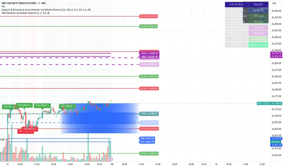
S&R Detector by Rakesh Sharma📊 Support & Resistance Auto-Detector
Automatically identifies key Support and Resistance levels with strength ratings
✨ Key Features:
🎯 Intelligent S/R Detection
Automatically finds Support and Resistance levels based on swing highs/lows
Shows strength rating (Very Strong, Strong, Medium, Weak)
Displays number of touches at each level
📅 Key Time-Based Levels
Previous Day High/Low (PDH/PDL) - Blue lines
Previous Week High/Low (PWH/PWL) - Purple lines
Optional Round Numbers for psychological levels
⚙️ Fully Customizable
Adjust sensitivity (5-20 pivot length)
Filter by minimum touches (1-10)
Control maximum levels displayed (3-20)
Optional S/R zones (shaded areas)
📊 Live Dashboard
Shows nearest Support/Resistance
Distance to key levels
Total S/R levels detected
🔔 Smart Alerts
PDH/PDL breakout signals
Visual markers on chart
Perfect for: Intraday traders, Swing traders, Price action analysis
S&R Detector by Rakesh SharmaSupport & Resistance Auto-Detector
Automatically identifies key Support and Resistance levels with strength ratings
✨ Key Features:
🎯 Intelligent S/R Detection
Automatically finds Support and Resistance levels based on swing highs/lows
Shows strength rating (Very Strong, Strong, Medium, Weak)
Displays number of touches at each level
📅 Key Time-Based Levels
Previous Day High/Low (PDH/PDL) - Blue lines
Previous Week High/Low (PWH/PWL) - Purple lines
Optional Round Numbers for psychological levels
⚙️ Fully Customizable
Adjust sensitivity (5-20 pivot length)
Filter by minimum touches (1-10)
Control maximum levels displayed (3-20)
Optional S/R zones (shaded areas)
📊 Live Dashboard
Shows nearest Support/Resistance
Distance to key levels
Total S/R levels detected
🔔 Smart Alerts
PDH/PDL breakout signals
Visual markers on chart
Perfect for: Intraday traders, Swing traders, Price action analysis
S&R Detector by Rakesh Sharma📊 Support & Resistance Auto-Detector
Automatically identifies key Support and Resistance levels with strength ratings
✨ Key Features:
🎯 Intelligent S/R Detection
Automatically finds Support and Resistance levels based on swing highs/lows
Shows strength rating (Very Strong, Strong, Medium, Weak)
Displays number of touches at each level
📅 Key Time-Based Levels
Previous Day High/Low (PDH/PDL) - Blue lines
Previous Week High/Low (PWH/PWL) - Purple lines
Optional Round Numbers for psychological levels
⚙️ Fully Customizable
Adjust sensitivity (5-20 pivot length)
Filter by minimum touches (1-10)
Control maximum levels displayed (3-20)
Optional S/R zones (shaded areas)
📊 Live Dashboard
Shows nearest Support/Resistance
Distance to key levels
Total S/R levels detected
🔔 Smart Alerts
PDH/PDL breakout signals
Visual markers on chart
Perfect for: Intraday traders, Swing traders, Price action analysis

S&R Detector by Rakesh SharmaSupport & Resistance Auto-Detector
Automatically identifies key Support and Resistance levels with strength ratings
✨ Key Features:
🎯 Intelligent S/R Detection
Automatically finds Support and Resistance levels based on swing highs/lows
Shows strength rating (Very Strong, Strong, Medium, Weak)
Displays number of touches at each level
📅 Key Time-Based Levels
Previous Day High/Low (PDH/PDL) - Blue lines
Previous Week High/Low (PWH/PWL) - Purple lines
Optional Round Numbers for psychological levels
⚙️ Fully Customizable
Adjust sensitivity (5-20 pivot length)
Filter by minimum touches (1-10)
Control maximum levels displayed (3-20)
Optional S/R zones (shaded areas)
📊 Live Dashboard
Shows nearest Support/Resistance
Distance to key levels
Total S/R levels detected
🔔 Smart Alerts
PDH/PDL breakout signals
Visual markers on chart
Perfect for: Intraday traders, Swing traders, Price action analysis

Combined Signal + Auto Day Plan + Volume📘 TradingView Description — Combined Signal + Auto Day Plan + Volume
Strategy Overview
This strategy combines trend-following signals, daily context levels, and volume confirmation to generate high-probability intraday trading setups.
It is designed to filter noise, identify trend direction early, and avoid trades during low-quality market conditions.
🔷 1. Combined Signal Logic
The strategy merges multiple indicators to produce a single, cleaner signal:
Long Signal
Trend bias is bullish
Momentum histogram (MACD/Custom) shows upward pressure
Price crosses above the midline (WMA/EMA/etc.)
Volume supports the move
Short Signal
Trend bias is bearish
Momentum histogram shows downward pressure
Price crosses below the midline
Volume supports the move
This reduces false breakouts and ensures signals appear only during strong directional moves.
🔶 2. Auto Day Plan Levels (D-1 → D)
The script automatically reads previous day levels and displays them on today’s session:
Previous Day High (PDH)
Previous Day Low (PDL)
Previous Day Close (PDC)
Previous Day Mid / Range Zones
Optional FIB levels or custom zones
These levels act as intraday support/resistance, helping identify breakout, reversal, and retest opportunities.
Behavior:
D-1 levels are plotted from today’s open until today’s close.
Levels do not overlap into the wrong day.
Optional: extend lines to next day (D+1) for planning.
🔷 3. Volume Confirmation
To improve entry accuracy, the script checks for strength in volume:
Volume > X-period average
Volume spike detection
Relative Volume (RVOL) filter
Optional low-volume avoidance
A trade is taken only when the market shows real participation, reducing traps and sideways chop trades.
🔶 4. Entry & Exit Logic
Entry
Long Entry: Combined bull signal + volume confirmation
Short Entry: Combined bear signal + volume confirmation
Exit
Long Exit → Histogram turns down (hist < hist )
Short Exit → Histogram turns up (hist > hist )
Optional:
Auto SL at PDL/PDH
Trailing based on midline
Take profit using FIB or volatility levels
💠 5. Visuals
The chart plots:
Buy/Sell markers
D-1 support/resistance lines
Trend direction midline
Volume confirmation label
Combined signal status
Colors and styles can be customized from the input panel.
🎯 6. Purpose of the Strategy
This is a complete intraday automation tool combining:
✔ Trend
✔ Momentum
✔ Volume strength
✔ Key day levels
The goal is to provide structured, mechanical, rule-based trading — reducing emotional decisions and improving consistency.

Core Suite Essentials This script provides institutional-grade, multi-factor market analysis in a unified toolkit. Its true sophistication lies in its ability to reveal the critical interplay—the "dance"—between its core components, offering a profound view of market structure, momentum, and trend health that goes far beyond standard indicators.
Core Differentiators
Reveals the Core Trend "Dance":
The script masterfully visualizes the critical interaction between three foundational elements:
Ichimoku (Tenkan Sen & Kijun Sen): The leading actors defining momentum and equilibrium.
Bollinger Middle Band (BBM): The dynamic stage of support/resistance.
This interaction provides an institutional-grade read on trend integrity:
Strong Trend: A clean, bullish alignment with the Tenkan Sen leading, the Kijun Sen following, and the BBM acting as firm support confirms a powerful, unified move.
Trend Break Warning: The BBM moving between the Tenkan and Kijun signals convergence and compression, a critical alert of weakening momentum and a potential reversal.
Multi-Timeframe Momentum Confirmation:
This core trend analysis is fortified with a layered momentum gauge, providing a robust, institutional-style confirmation system:
Proprietary RSI-Based Bands across weekly, daily, and intraday frames.
Stochastic Channels (Sto12/Sto50) for additional context on price position.
Strategic Filters for Swing & Position Traders:
For higher-timeframe analysis, it delivers essential quantitative tools:
AnEMA29 Angle: Objectively quantifies trend strength and direction.
PDMDR (DMI Ratio): Measures directional dominance to filter low-conviction markets.
Integrated Cross-Asset Intelligence:
Completing the institutional perspective is a Correlation & Hedging Assistant, contextualizing price action against peers and identifying strategic opportunities based on RSI divergences.
Conclusion
This is not a mere collection of indicators; it is a consolidated analytical workstation. It captures the nuanced "dance" of the core trend triad, layers on multi-timeframe momentum confirmation, and provides strategic filters for timing and cross-asset context. This holistic, institutional-grade approach delivers a definitive and actionable market narrative.
ICHIMOKU
@insomniac_vampire

Punjis Dynamic Daily EMA/SMA 5,9,21,50,100 LevelsPunjis Dynamic Daily EMA/SMA 5,9,21,50,100 Levels
Overview:
This indicator displays daily timeframe moving averages as horizontal lines extending to the right of your chart, regardless of what timeframe you're currently viewing. It includes six key moving averages: EMA 5, EMA 9, EMA 21, SMA 50, SMA 100, and SMA 200.
Key Features:
Clean Chart Design: Unlike traditional moving average lines that clutter your chart with curves across all candles, this indicator uses horizontal lines that extend only from the current price level to the right edge of your screen
Multi-Timeframe Analysis: View daily moving averages on any intraday timeframe (1min, 5min, 15min, etc.) without switching charts
Fully Customizable:
Toggle each moving average on/off independently
Adjust the period length for each MA
Customize colors for each line
Master toggle to show/hide all lines at once
Reduced Visual Noise: Horizontal lines keep your price action clean and easy to read while still providing critical support/resistance levels
Professional Layout: Perfect for traders who need to monitor multiple key levels without obscuring candlestick patterns and chart analysis
Benefits of Horizontal Lines:
Cleaner Charts: Traditional MAs draw lines through every candle, creating visual clutter. Horizontal lines only show current values, keeping your chart clean
Focus on Current Levels: What matters most is where the MAs are NOW relative to price - horizontal lines highlight this instantly
Better Price Action Visibility: See candlestick patterns, volume, and support/resistance levels clearly without MA lines crossing through them
Quick Reference: Instantly identify if price is above or below key moving averages without following curved lines across the chart
Professional Appearance: Clean, minimalist design preferred by institutional traders and technical analysts
Use Cases:
Day traders monitoring higher timeframe levels on intraday charts
Swing traders tracking daily moving averages as dynamic support/resistance
Multi-timeframe analysis without chart switching
Identifying trend direction and potential reversal zones
Clean workspace for pattern recognition and price action trading

(5+15+60min+1D)EMA20+Y'SH/L+count简介: 这是一个专为 5分钟图表 (5min Chart) 日内交易者设计的综合辅助工具。它结合了多周期趋势均线、美股核心交易时段的时间周期计数以及关键流动性位置(前一日高低点)的智能突破监测。该脚本针对美股个股及 24/7 交易的 BTC/ETH 进行了优化,强制锁定纽约时间进行运算。
核心功能:
1. 多周期 EMA 监控系统 (MTF EMAs)
5min EMA20 (蓝色):日内短期趋势核心线(默认开启)。
60min EMA20 (绿色):小时级别趋势参考(默认开启)。
15min EMA20 (红色) & 1D EMA20 (橙色):可选开启,用于捕捉更大周期的支撑阻力。
特点:所有均线采用最细线宽,平滑显示,右上角表格实时展示当前价格。
2. 美股时段 Bar Count 计数器
时间锚定:以纽约时间 (New York Time) 09:30 开盘为起点(Bar 0)。
显示规则:仅在 K 线底部显示 偶数 序号 (0, 2, 4, 6 ...),直至第 82 根 K 线停止。
关键时间窗 (Time Pivots):
Bar 18 (约 NY 10:55) 和 Bar 40 (约 NY 12:45) 会被自动高亮。
字体变为 蓝色粗体,且对应 K 线实体变为蓝色,提示潜在的变盘或宏观流动性注入时刻。
3. 智能 PDH/PDL 射线 (Smart Rays)
精确锚点:前一日高点 (PDH) 和低点 (PDL) 的射线不是从开盘画起,而是从昨日形成高低点的具体时间点射出,精确还原价格行为。
自动阻断 (Breakout Logic):一旦当前价格触碰或突破该射线,射线将自动停止延伸,直观展示“阻力/支撑已失效”。
自动清理:每日自动清除旧线,仅保留当天的参考线,保持图表整洁。
4. 视觉优化
每日分割线:自动绘制灰色虚线分隔交易日。
图表限制:脚本仅在 5分钟图表上可见,切换周期自动隐藏,避免干扰大周期分析。
设置说明:
可在设置面板中自由开关各周期 EMA 的显示。
可开关底部的计数数字显示。
English Version (for TradingView Publishing)
Title: 5min Intraday Precision Toolkit: MTF EMAs + NY Session Count + Smart Rays
Introduction: This is a comprehensive auxiliary tool designed specifically for 5-minute chart intraday traders. It combines multi-timeframe trend EMAs, time cycle counting based on the US Session, and smart breakout monitoring for key liquidity levels (Previous Day High/Low). Optimized for US Equities and Crypto (BTC/ETH) using New York Time.
Key Features:
1. Multi-Timeframe EMA System
5min EMA20 (Blue): Core short-term intraday trend (On by default).
60min EMA20 (Green): Hourly trend reference (On by default).
15min EMA20 (Red) & 1D EMA20 (Orange): Optional overlays for higher timeframe support/resistance.
Visuals: All EMAs are rendered with fine lines for a clean look, accompanied by a top-right dashboard table.
2. NY Session Bar Count
Time Anchor: Starts counting from 09:30 New York Time (Bar 0).
Display Logic: Displays only EVEN numbers (0, 2, 4...) at the bottom of the bars, stopping at count 82.
Time Pivots:
Bar 18 (~10:55 NY) and Bar 40 (~12:45 NY) are highlighted.
Labels turn Bold Blue, and the specific candles are colored Blue to indicate potential reversal or liquidity injection times.
3. Smart PDH/PDL Rays
Precise Origin: Rays for Previous Day High (PDH) and Previous Day Low (PDL) originate from the exact timestamp they were created yesterday, not just the daily open.
Breakout Stop Logic: Rays automatically stop extending once price touches or breaks them, clearly indicating that the level has been tested.
Auto-Clean: Automatically removes old rays from previous days to keep the chart clean.
4. Visual Optimization
Daily Separators: Automatic vertical dotted lines marking new days.
Visibility: All elements are hidden on non-5m charts to prevent clutter.
Settings:
Toggle visibility for individual EMAs.
Toggle visibility for the bottom bar counter.

Advanced Volume Suite (24h, Pulse, Spikes, Breakout Pressure)Advanced Volume Suite transforms raw volume into a complete market-intelligence toolkit for breakout, momentum, and liquidity-driven trading.
Unlike the basic volume indicator, this tool analyzes volume in true USDT value, tracks rolling 24h exchange-style volume, measures volume strength vs historical averages, detects smart spikes, and highlights breakout pressure near support/resistance.
Core Features:
• USDT-based volume histogram
• 24h rolling volume line
• Volume Pulse (volume vs moving average)
• Smart spike detection with directional filters
• Breakout pressure system (breakouts + near-breakout conditions)
• 3 advanced volume color modes (Simple / Body / Delta-style)
• All signals and thresholds fully configurable
Perfect for traders who rely on volume confirmation for breakouts, momentum entries, scalping, or detecting institutional activity.
